

Accessibility is often misunderstood as a compliance checkbox; it is considered as something added at the end of a project to satisfy guidelines. Accessibility, in reality, is a design philosophy that shapes how a website is built from its foundation. When a website is accessibility first, it becomes usable by everyone, including people with motor disabilities, screen reader users, and even power users who prefer keyboard navigation. At the same time, accessibility contributes directly to sustainability, because accessible websites are simpler, cleaner, faster, and require fewer resource heavy fixes later.
One of the most important and practical aspects of accessibility first design is ensuring that your website is fully keyboard friendly. This aligns with WCAG 2.2 AA standards defined by the World Wide Web Consortium and ensures that users can navigate, understand, and interact without relying on a mouse.
Let us walk through the key steps that make this possible.
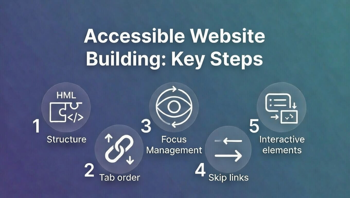
- Start with Native HTML Elements
The correct HTML elements forms the foundation of keyboard accessibility. Native elements such as buttons, links, and form controls are designed to work with keyboards by default. When developers replace these with generic containers like div or span, they remove built in accessibility without realizing it.
For example:
- Use <button> for clickable actions
- Use <a> for navigation links
- Use <input> and <select> for forms
These elements automatically support keyboard focus, activation, and screen reader interpretation. Eventually, this reduces the need for extra code and creates a more sustainable, maintainable system. In contrast to this however,, recreating these behaviors manually increases complexity. You make your system susceptible to introduce bugs, and consume more development time and computing resources.
- Make Focus Visible and Clear
When users navigate with a keyboard, they rely on visual focus indicators to know where they are on the page. Removing focus outlines without replacing them creates invisible navigation, which makes the site unusable.
The advice here is, never remove outlines without providing an alternative. Instead, enhance them with clear styling such as:
- High contrast borders
- Background highlights
- Subtle glow or underline
This improves usability and also enhances the overall user experience. A visible focus system reduces confusion, reduces user frustration, and ensures smoother interaction for everyone.
- Maintain a Logical Tab Order
Keyboard navigation follows the order of elements in the HTML structure. This order must match the visual and logical flow of the page.
To maintain proper focus order:
- Structure content from top to bottom in meaningful sequence
- Avoid using positive tabindex values like tabindex=”1″ or tabindex=”5″
- Use tabindex=”0″ only for custom interactive elements
- Use tabindex=”-1″ for elements that need focus programmatically, such as modals
When tab order is logical, users can predict where the navigation will move next. This predictability is essential for accessibility, and it also reflects good design discipline. A logical structure, moreover, improves code clarity, making the website easier to maintain and scale over time.
- Add a Skip to Main Content Link
It is important to note that keyboard users should not be forced to navigate through menus repeatedly on every page. A simple “Skip to Main Content” link allows users to jump directly to the primary content area. This small addition has a major impact on usability, especially for screen reader users.
It improves efficiency, reduces frustration, and ensures that navigation remains purposeful rather than repetitive. You will realise that this is not just an accessibility improvement. It is also a performance improvement in human terms, reducing effort and cognitive load.
- Handle Menus, Dropdowns, and Modals Properly
You must have noted that interactive components such as menus and modals often create accessibility problems if not handled carefully. It is thus, that, when a modal opens, keyboard focus should move inside it and remain there until the modal closes. This is called a focus trap. Without it, users can accidentally navigate behind the modal, creating confusion and broken interaction.
So, it is crucial to make sure that:
- Users can navigate within the modal using Tab
- Users can close it using Escape
- Focus returns to the original trigger after closing
This creates a complete and logical interaction cycle. It is in these small details that a big difference is made between a functional system and a truly usable one.
Test Your Website Using Only the Keyboard
One of the simplest and most effective accessibility tests requires no tools at all. Use the Tab key and navigate through your entire website and check for the following:
- Every interactive element is reachable
- Every focused element is visible
- Enter and Space activate buttons and links
- You can enter and exit menus and modals easily
This simple test reveals most accessibility issues immediately. You can also use tools that help identify deeper structural issues, some such are namely,:
- Lighthouse Accessibility Audit
- WAVE Accessibility Tool
- axe DevTools Extension
Accessibility and Sustainability Go Hand in Hand
Accessibility first design naturally leads to sustainability. The primary reason behind this is accessible websites are:
- Simpler in structure
- Faster to load
- Easier to maintain
- Less dependent on heavy scripts
Cleaner code consumes fewer resources while faster websites use less energy. Additionally, maintainable systems last longer. This in turn reduces technical debt, reduces rebuild cycles, and creates a more sustainable digital ecosystem. Accessibility, thus, is not extra work it is smarter work done at the right time.
To wrap it up – When accessibility becomes part of the development mindset, websites become more resilient. They handle growth better, adapt to new devices easily, and serve a wider audience without additional effort. More importantly, accessibility reflects respect for users, and it ascertains that no one is excluded because of how they interact with technology.
Building keyboard friendly websites is not just about compliance but about creating digital spaces that are inclusive, efficient, and sustainable. And in a world where digital presence defines credibility, accessibility first design is no longer optional. It is a necessity.